As we enter our centennial year, Ketchum seized this moment to unveil an innovative brand refresh – a major milestone in our commitment to the reinvention of progress. We’re asking Jim Joseph, our global CMO and U.S. CEO, to share an inside look at the why and how of our new brand identity and what it means for our clients and employees going forward.
This year marks Ketchum’s 100th – was that the impetus behind reimagining the brand?
This year is an important milestone, but it was not the only driver. In the past few years, the world has changed profoundly. We know there’s no going back and there’s no new normal, but we also know we can’t let that stop us from forging ahead. We have learned so much about how to collaborate and support each other with empathy in unimaginable circumstances. Now we’re passionate about applying what we have learned in ways that are tangible to both employees and clients. Our centennial along with the realities of the world we live in are the perfect time to reimagine our brand.
Revisiting a brand is a big undertaking. How did you approach it?
As a communications consultancy guided by empathy and intelligence, we knew it was important to engage with our stakeholders in the current context. We did our discovery work to better understand who they are today and how we can best show up for them tomorrow. We talked to groups across Ketchum, we researched CCO and CMO needs, and we factored in our employee value proposition, Better for Being Here. And then we dove into the creative. It was a truly global and democratic process.
Talk to us about the meaning behind the new logo, colors and tagline.
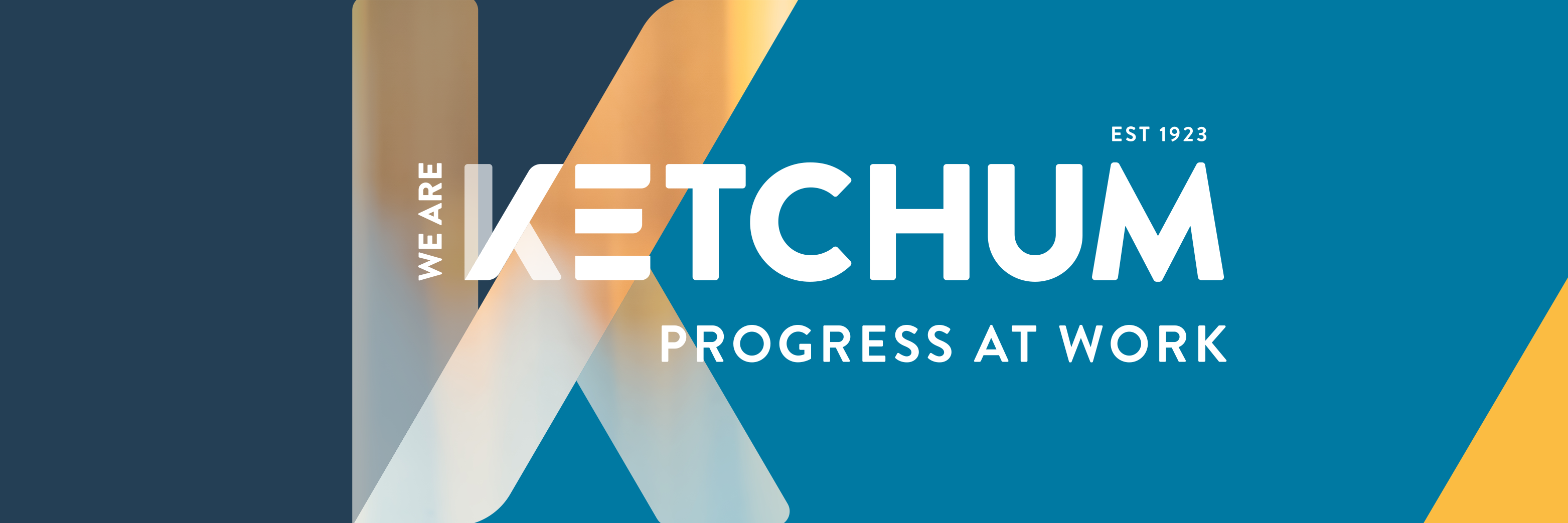
OK, but I’m warning you I’m going to geek out a bit because I love branding and design. It all starts with our K, a custom letterform created with a forward slash to evoke motion and progress. The K should suggest to you that it’s stepping forward, while at the same time, the way we’ve adjusted the E creates a sense of elevation and momentum — which relates directly to Kinetic Energy. Together these two letterforms represent our unique Ketchum Energy.
And it doesn’t stop there. When you read between the lines of the E, you’ll see an equal sign to highlight our commitment to diversity, equity and inclusion. The typeface we’re using for the wordmark points back to font families prevalent in the 1920s … the same decade Ketchum was established.
Our color palette has been carefully curated to be fresh, vibrant and evocative of who we are. Our main color, blue, represents confidence, signaling that we are experts in leading through change. Brimming with life and renewal, green signals purpose, the fuel that keeps us going. Our ocean blue embodies Ketchum’s depth of experience, and our sky blue brings brightness to our search for connection. Gold symbolizes the achievements we strive for, and magenta represents our empathy.
Our new tagline, Progress at Work, captures who we are and what we treasure. What lights us up about our work. Each of us at Ketchum wants to progress. Every client wants to make progress on their business objectives and goals. Our work progresses each day and every time we reach a milestone. And let’s be honest, the world is a work in progress right now.
All of these come together as our declaration: this is who Ketchum is now, what we value, and who we want to be in the world.
What’s next?
So many things. Later this year we’ll launch our proprietary framework for auditing, reporting and scoring brands on various indicators of progress in the world. I’m excited to see how this is taking shape; I spend a lot of time with clients, and I can see the unique ways we will be bringing them insights.
And there’s our centennial year. While other agencies have come and gone, Ketchum has stood the test of time — but certainly not by standing still. We’re a case study in transforming to meet changing business and client needs. We’re using everything we’ve learned from our past to chart an even better future. I’m incredibly proud of our people and I can’t wait to see where we go from here!


